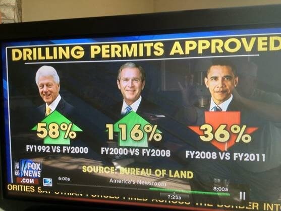
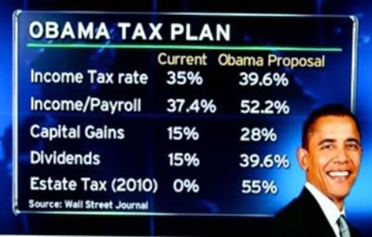
They say a picture is worth a thousand words, and when that picture is a graph or statistical representation, it represents a wealth of mathematical work as well. Nevertheless, graphs can be misleading, and statistics is one of the opportunities that intelligent people can use to hypnotize others with the seeming inevitability of factual basis. That being said, the following graphs should be taken as nothing definitive, but food for thought, a suggestion of how things are that admittedly leave out the full picture and without further investigation could even be called misrepresentations. Is Obama really the “socialistic president” or is the picture more nuanced than that?
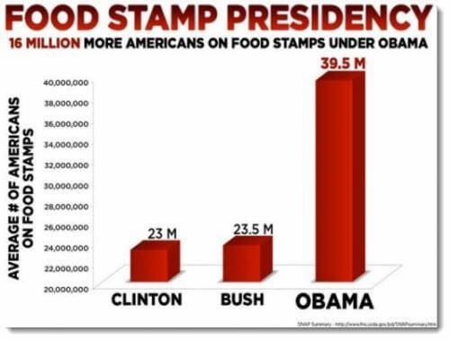
But of course, the Obama years fell under the great recession, which may have little to do with his efficacy as a president.
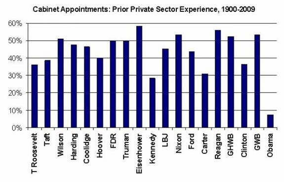
There is no suggestion as to why this might be.
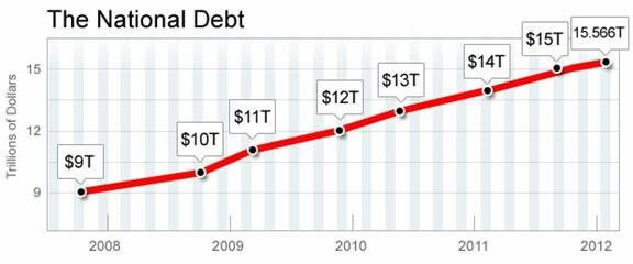
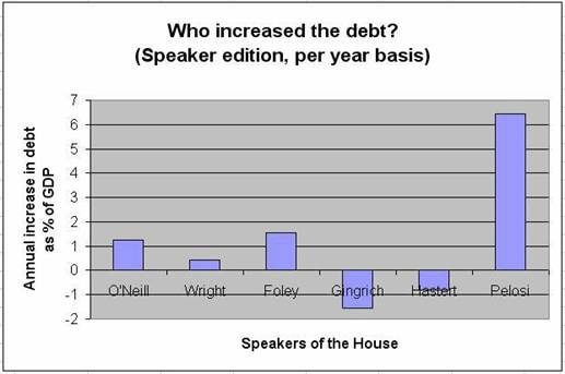
The national debt has indeed gone apocalyptic, and it is a problem we had to face in settling the Fiscal Cliff, but there are some economic contingencies to consider in this as well.
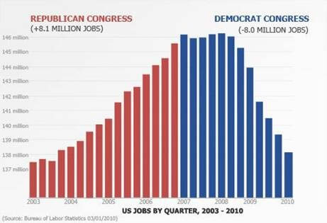
Yes, but a president’s policies don’t necessarily have immediate consequences, and much of this relates to the Great Recession which had more to do with banking mistakes than presidential folly.
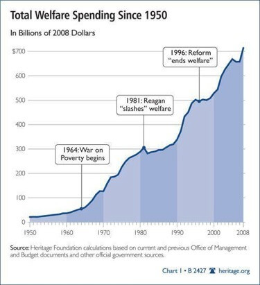
According to this, things were pretty steep before Obama took office.
Graphs like this are misleading since they don’t start at zero. This one starts at 20,000,000
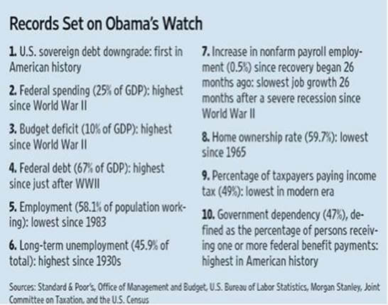
These sorts of stats are more suggestive and interesting than some of the others.
This graph requires more balance in filling out the “why.”
An oversimplification.
The new system of government would in fact require a “change” of higher taxes all around.
Though one might validly criticize Obama’s presidency and his views on taxation and government spending, best to be careful in the use of “slam-dunk” graphs that might misrepresent the complexity of the situation.


